
Inclusive design: Designing for the colour-blind
How can ‘Design’ better the lives for people with colour-blindness?
Written by Marissa Tang

Does a world with limited colours seem far-fetched to you? Well, not for the estimated 300 million coloured blind people in the world. The most common colour-blindness is red-green colour deficiency and people who suffer from it not only confuse colours with red or green hues, but also blue and purple as they cannot ‘see’ the red hue within the purples.
According to Colour Blind Awareness, 1 in 200 women are colour-blind while 1 in 12 men are. This means that 95% of the colour-blind community are men.
Let’s run 2 simple tests to find out if you are colour-blind

Colour-blind tests 1 and 2
Do you have your answers ready?
For the first test with balloons, do you see at least 7 colours? They are:

Answers to colour-blind test 1
Bonus marks if you have guessed pink and silver!
For the second test, did you manage to guess the number within each circle? They are:
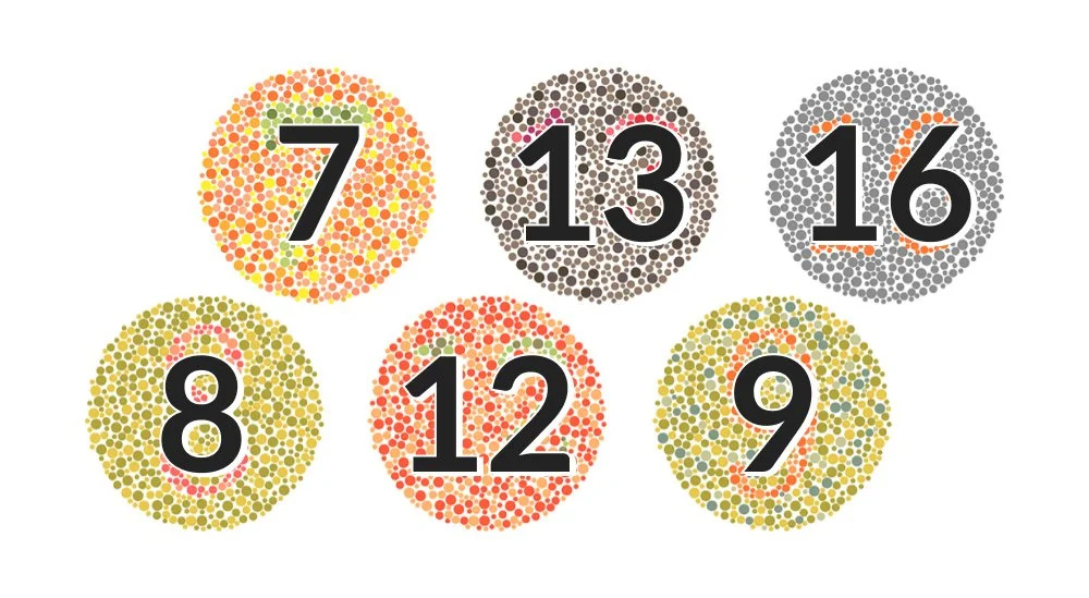
Colour-blind test 2: Shows coloured dots shaped into a number, on a coloured dotted background
If you have normal vision, you should not be struggling to spot the numbers. If you only spot some, or you were thinking “Wait, the circles had a number in it?’, you’re most probably colour-blind.
Since my Dad is colour-blind, I thought it will be fun to test him. Here are his responses:

Colour-blind test responses
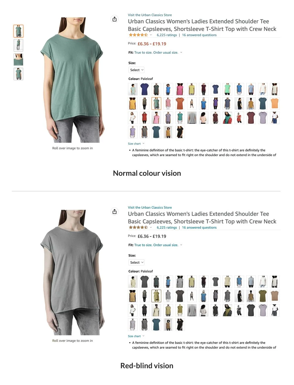
Now imagine a world of online shopping where varied colour choices are available. An individual who suffers from colour-blindness will be confused at the subtle differences in choices offered.
Or travelling to a foreign land and having to see maps that rely too much on colour. This will be confusing to colour-blind viewers.
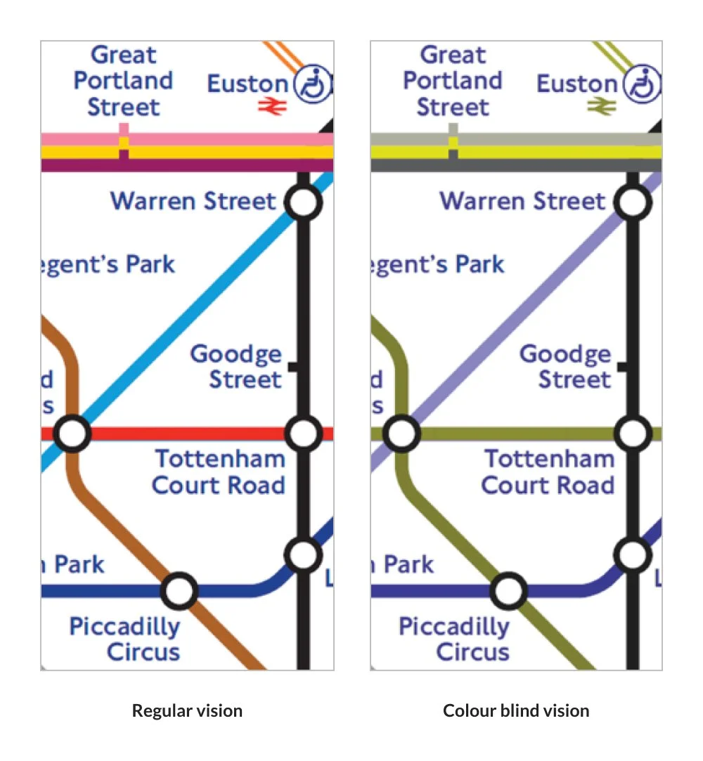
Example of using a train map overseas
“There’s a big difference between not being able to distinguish between two colours and not being able to use an interface because one can’t distinguish between two colours.”
This is where design can play a part.
Well-executed colour-blind friendly designs are so subtle you’d never even notice them. They are the websites that indicate a clothing’s colour in the title, presentations that use textures in graphs instead of just colours or in Spotify’s case, a simple dot.

With a dot indictator in the Spotify play bar, it shows users that button is ‘active’

Without an indicator in the Spotify play bar, it shows users that button is ‘inactive’
For an individual who cannot tell the difference between green or grey, the dot is there to save the day! Simple but effective.
So after getting a tiny glimpse of what it is like being colour-blind, let’s get right to it.
How might we design for individuals with colour deficiencies so that they can have a hassle-free experience?
Here are some best practices to keep your design colour-blind friendly:
01.
Avoid bad colour combination and increase contrast
Avoid the following colour combinations which are especially hard on colour-blind people: Green & Red; Green & Brown; Blue & Purple; Green & Blue; Light Green & Yellow; Blue & Grey; Green & Grey; Green & Black.

Example of bad colour combinations
If you are stuck and must use one of the above combinations, try adjusting the shades so one is extremely dark, and the other extremely light.
Contrast isn’t an issue for most people who are colour-blind. You can even experiment using a range of clearly contrasting colours and hues in your design.
02.
Use both colours and symbols
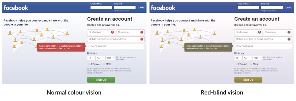
You shouldn’t rely on colour alone to convey a message: Certain colour-blindness makes it difficult to see red error messages. In the example of the Facebook registration form, if the form relied on colours alone on the error state, it might look something like this to red-blind (protanopia) users:

This may frustrate the user as he is clueless about what is wrong during his registration process. By adding symbols and error messages, this makes the experience more colour-blind friendly:
03.
Use patterns and textures to show contrast
The next time you present using graphs and infographics, do not just use colours but consider using textures for elements that require emphasis. Colour-blind individuals can still perceive contrast, as well as differences in hue, saturation and brightness.
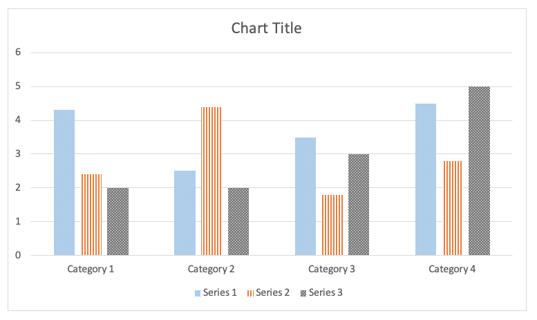
Example of textured chart
04.
Keep your colour palette minimal
Not only is minimalistic design a timeless and aesthetically pleasing, it is also useful when designing for colour accessibility.

Example of minimal colour palette
For those of us fortunate enough to see the full spectrum of colours, I hope this article shed some light on the struggles that people with colour-blindness face.
To my fellow designers, here is a quote that serves as a friendly reminder when designing for digital experiences:
“Left unchecked, technology turns people into proxies. That’s why it’s so crucial that we integrate empathy and compassion into the design process.”
And to those who do not dabble in designing experiences, let’s strive to show some empathy to those around us:
Listening with the ears of another,
Feeling with the heart of another &
In this case, seeing with the eye of another.
Photo & video sources
Colour-blind example test 1: We are Colour Blind
Colour-blind example test 2: Shutterstock
E-commerce example: Amazon
London tube map example: Brilliant Maps
Spotify example: We are Colour Blind
Best practice 1 Avoid bad colour combinations: Smashing Magazine
Best practice 1 Avoid bad colour combinations: Venngage
Best practice 2 Use both colours and symbols: Secret Stache
Best practice 3 Use patterns and textures to show contrast: NC State University
Best practice 4 Keep your colour palette minimal: hoteldaniel.com
Video of groom seeing colours for the first time: YouTube