
Invisible complexity: Untangling internal financial workflows through purposeful design
Behind every intuitive internal platform is a layered environment of roles, rules, and processes working together to create a fully functioning system. Discover how enterprise UX design brings clarity to complex internal financial platforms, so teams can focus on what matters most.
Written by Nurlin Adillia

Source: EY
In financial services, the tools that internal teams use every day—dashboards, approval systems, onboarding platforms—are often where real complexity lives.
Our role as designers isn’t to make that complexity disappear, but to make it manageable. What may appear on the surface as a clean, straightforward interface is often the result of layered decisions, logic, and conditions working seamlessly behind the scenes.
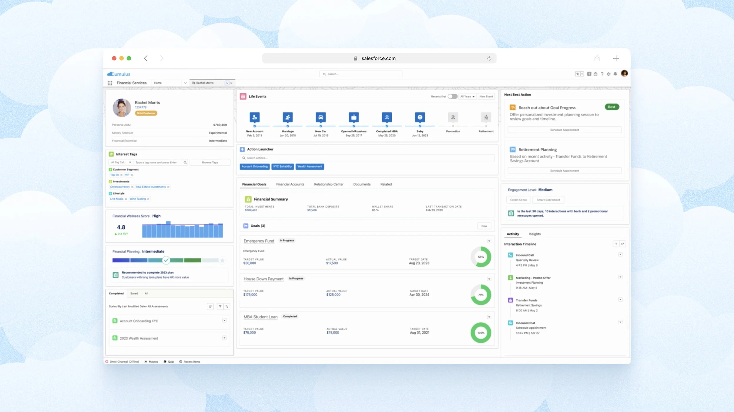
Salesforce’s financial services platform allows internal teams working in financial organisations to view customer data.
This article delves into reflections from the 4 years I’ve dedicated to tackling a range of challenges, including designing complex internal platforms for financial organisations. Through these experiences, I’ve developed a keen understanding of how to simplify without oversimplifying, bringing much-needed structure and logic to complex processes.
In finance, complexity is part of the job
Internal platforms often need to manage multi-step approvals, role-based permissions, and strict compliance requirements. Throw in legacy technical systems, high data sensitivity, and platform-specific behaviours across regions, and you start to get a glimpse of the density of these systems.
To support decision-making in this environment, design needs to do more than look clean—it needs to reinforce trust, clarity, and reliability. Design decisions that support these outcomes lead to better performance, fewer errors, and faster workflows.
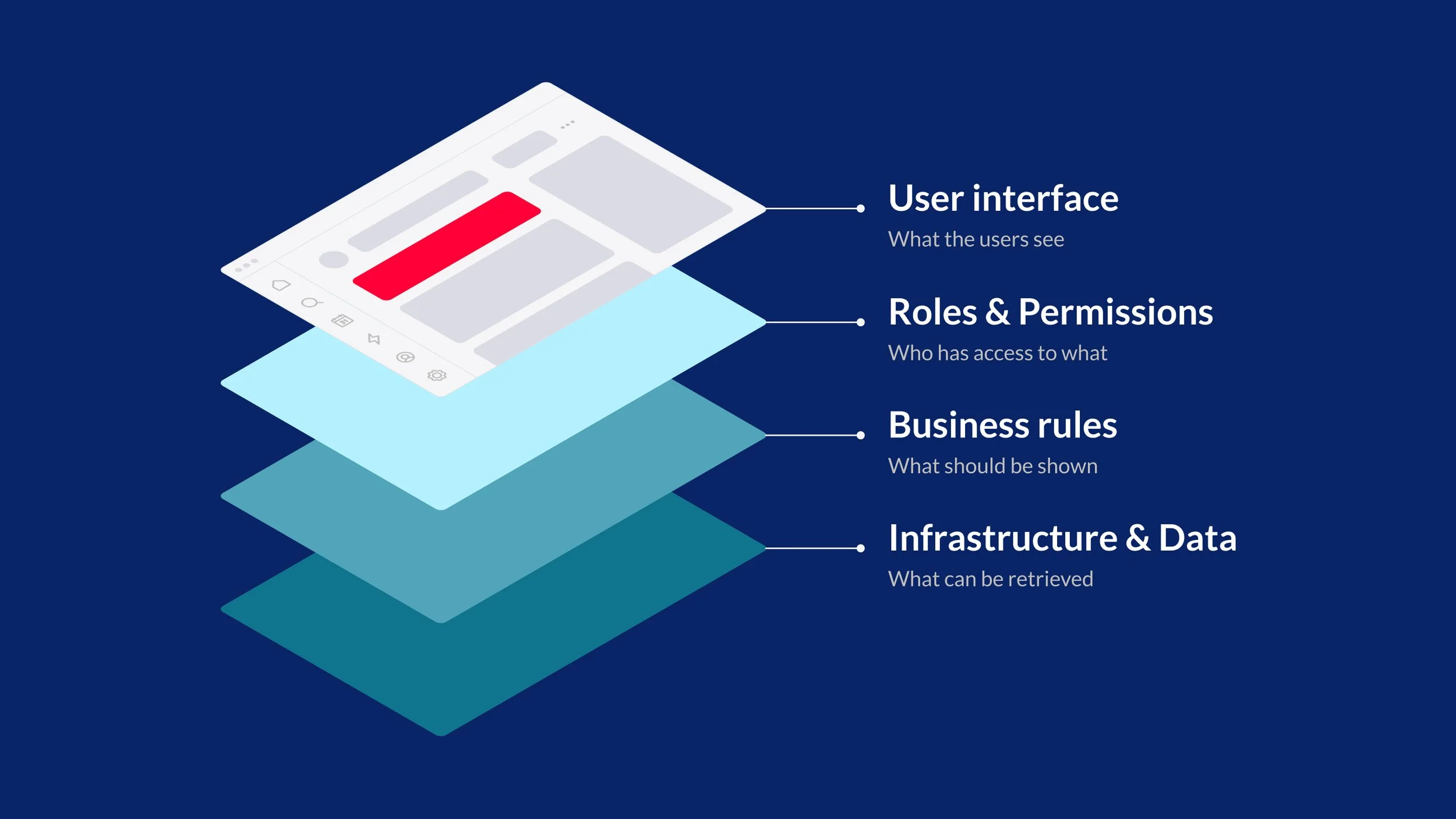
A visual breakdown of how system constraints, business rules, and user roles work together beneath the surface to shape what appears on a financial platform’s user interface.
Complexity factor #1
Designing around data-dense screens and workflows.
For financial tools, it means reducing cognitive load and surfacing the most relevant information without compromising logic. Some approaches include using progressive disclosure to hide non-critical information until it's needed, designing smart defaults, or sequencing actions to match how users think.
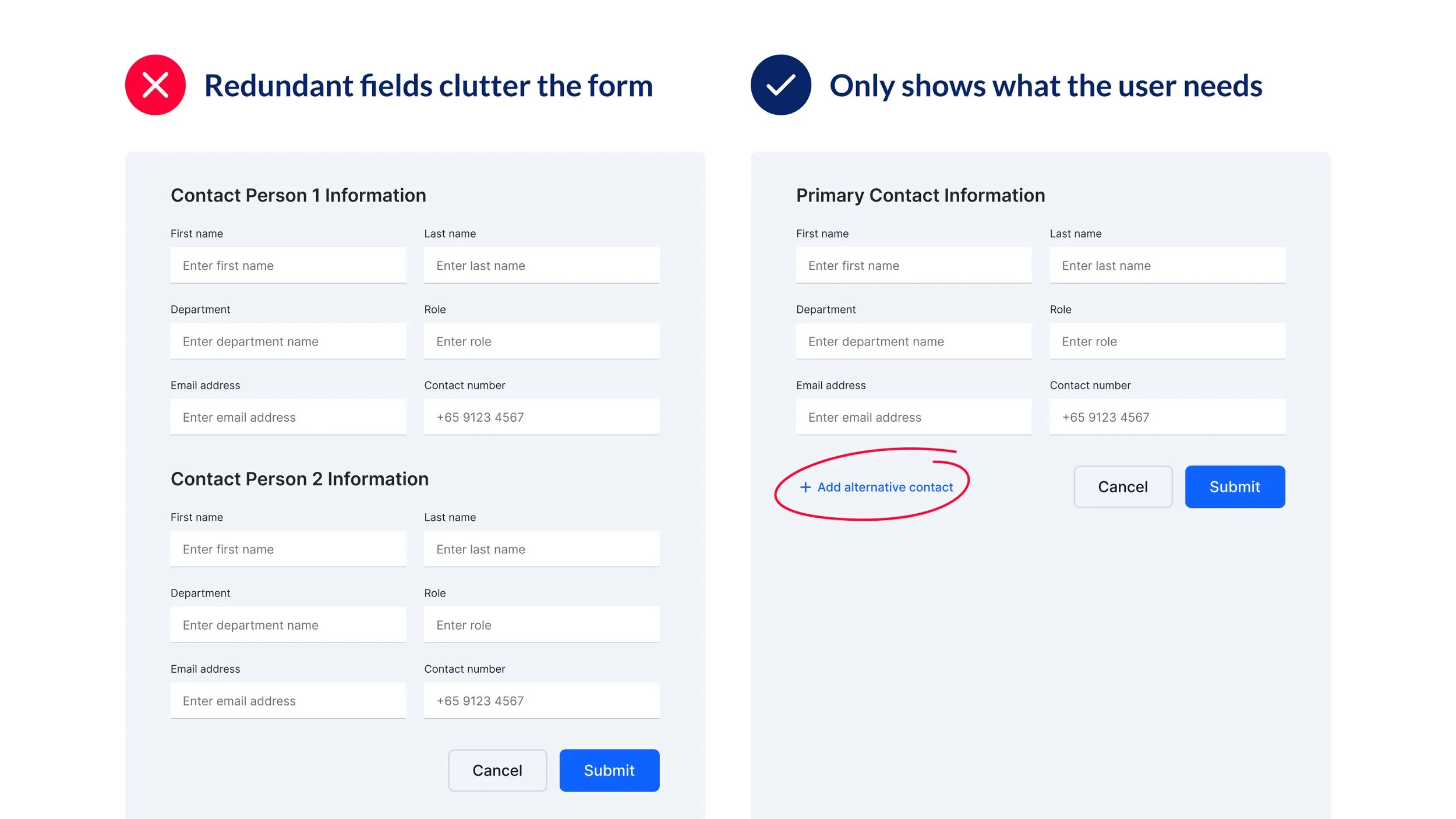
Example of progressive disclosure in a workflow.
While surfacing relevant information supports clearer thinking, it also has a technical impact, especially when volumes of data affect interface load times. Platforms that pull data from multiple sources can easily become sluggish if too much information is loaded at once. To keep things responsive, we need to consider how much data to show, when to show it, and what users need upfront. There’s a balance between instant access and sensible pacing.
I’ve encountered a challenge where a data table with dozens of columns not only impacted platform performance but overwhelmed users. To address this, I worked closely with stakeholders to prioritise key columns for immediate display, while making less critical information accessible through a customisable view modal. This allowed users to tailor the table to their reporting needs without sacrificing clarity or system responsiveness. Users are thus empowered to access the depth of data required, while keeping the interface both performant and user-centric.
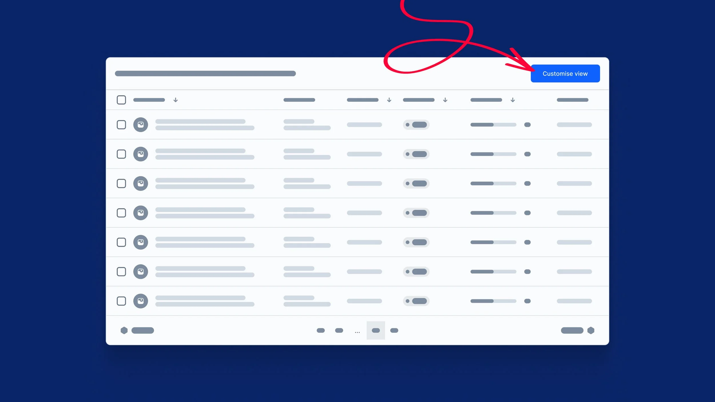
Example of a data table with the ability to customise data columns.
Of course, deciding what data is shown is only part of the equation. How that information is structured and presented is equally important. Establishing a clear hierarchy, such as distinguishing editable fields from system-generated data, reduces cognitive load and helps users navigate complex financial platforms with confidence.
Complexity factor #2
An added layer: navigating governance and risk management
How might we use design to guide careful action through a layered environment, without unnecessarily slowing momentum?
Purposeful friction is one design tool that reinforces user control and upholds security and accountability. For example, when executing high-stakes actions, a confirmation modal might replace a dismissible toast to emphasise the gravity of the decision.
I once worked on a financial onboarding platform involving multiple departments. If one person rejected a customer’s onboarding, that decision overrode everyone else’s input in the chain. Originally, this confirmation was done with a simple toast notification—too quick, too easy to miss. I advocated for a confirmation modal instead, one that would require the reviewer to pause, double-check, and explicitly confirm the rejection. This added moment of friction ensured that such a consequential step wasn’t taken lightly or by mistake. By embedding purposeful friction into the interface, design transforms beyond usability, serving as an essential safeguard in environments where precision and caution are paramount.
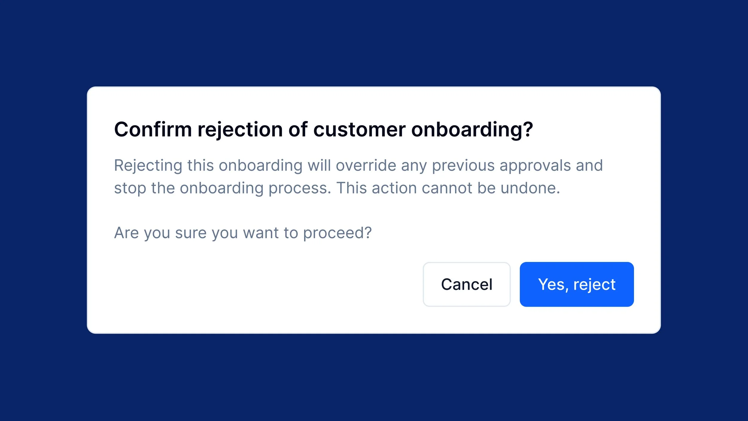
Example of a confirmation modal to review a rejection decision before confirming—a high-stakes actions.
Complexity factor #3
Internal users are not beginners; they're experts with habits.
One of the trickiest things about improving internal platforms is that you’re designing for people with deep domain knowledge—users with habits, workflows, and shortcuts they rely on. While it’s tempting to make bold changes in the name of clarity or efficiency, even small tweaks can disrupt how people work. When those workflows drive fast-moving financial operations, that disruption carries weight. It’s a reminder that complexity doesn’t just come from the systems themselves, it also comes from the people who’ve adapted to them.
For example, consider a compliance team that regularly exports data to Excel from a reporting dashboard, sometimes multiple times a day. Previously, the “Export to Excel” button was easily accessible in the top-right corner. After a redesign aimed at decluttering the interface, it was tucked away inside a “More actions” dropdown alongside less frequently used features like “Print view” or “Email report.”
What was once a one-click action now required extra scanning and interaction. For users who had built muscle memory around that task, this seemingly minor change disrupted a well-established workflow. In fast-paced environments where accuracy and efficiency are essential, even small delays can reduce productivity and increase frustration.
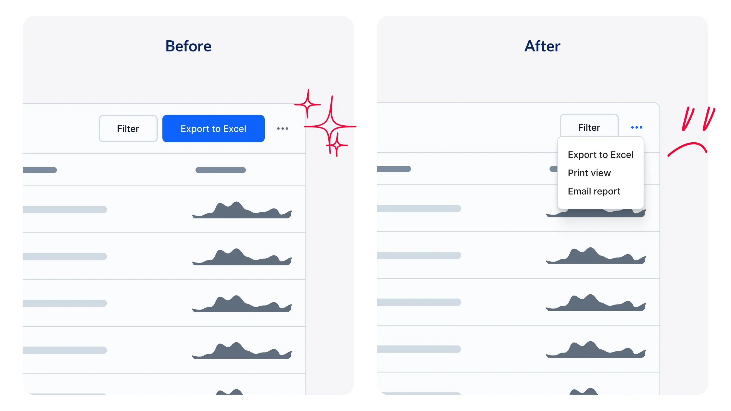
A before-after example of an "Export to Excel" button for a reporting table.
Instead of over-optimising for visual simplicity, we should aim to strengthen what already works. In this case, a better approach could’ve been to monitor usage patterns—through reviewing usage logs or conducting brief observation sessions with users—before making design enhancements. This ensures commonly used actions remained easily accessible, even as the interface was streamlined.
By evolving workflows with empathy, we help interfaces become intuitive extensions of how people already work, not obstacles in their way. Involving actual users in the redesign process—through brief user acceptance testing sessions, prototype reviews, or even quick feedback loops after implementation—can catch these workflow disruptions before they impact productivity.
The benefits of good internal UI extend across teams and systems.
While internal-facing design rarely makes headlines, its impact is significant. The improvements we make might not be apparent to end users, but they matter to the business. Thoughtful design keeps systems running, decisions moving, and operations aligned.
Faster workflows reduce operational costs
When interfaces are intuitive, users spend less time navigating the system and more time doing meaningful work. Streamlined experiences reduce friction and manual effort, allowing teams to move faster, make decisions quicker, and ultimately lower the cost of doing business.
Clearer UIs lower error rates and compliance risks
In industries where compliance is critical, clarity in design isn’t just helpful, it’s essential. Interfaces that make it easy to input the right data, avoid missteps, and understand next steps help reduce errors that could otherwise lead to regulatory or financial consequences.
Familiarity increases adoption across teams
Designs that reflect users’ mental models and workflows build trust. When internal tools feel familiar and aligned with how people work, adoption improves and resistance to change decreases.
Small design decisions create ripple effects across departments
It's often the smallest design choices—labels, button placement—that have the greatest impact at scale. When these elements are carefully considered, they reduce ambiguity, enable smoother collaboration, and improve cross-functional alignment across teams and departments.
Closing thoughts
What I've learned from designing these intricate internal financial platforms is that the most valuable work happens beneath the surface. The best designs don't eliminate complexity but transform it into clarity. The most successful interfaces I've created weren't the flashiest or most minimal; they were the ones that made complex processes feel manageable and gave users confidence in high-stakes decisions.
As designers in this space, our success isn't measured just by visual appeal, but by enabling internal teams to work with greater accuracy, efficiency, and confidence. When we get it right, the complexity becomes invisible: not because it's gone, but because it finally makes sense, empowering teams to focus on their expertise rather than wrestle with the tools they use.